Exit this page
Give users a way to quickly and safely exit a service, website or application.
Before you use this component
You should only use this component on pages with sensitive information that could:
put someone at risk of abuse or retaliation
reveal someone’s plans to avoid or escape from harm
For example, when someone is using a service to help them leave a domestic abuser.
You can use this component on either:
all the pages in a service
any page in a service with sensitive information
You can also use this component for standalone content pages.
Keep in mind that seeing this component might discourage some users from using the service. If the user does not identify themselves as being at risk, they might see the button on a service and decide it’s not relevant to them.
If you use this component on all pages in a service, there’s also the possibility that the user will unconsciously ignore the button as they focus on the content they’re actively seeking.
Placement
This component is designed to be clearly visible on the content page at all times, for example directly below the H1 title of your page. You can view an example of the button on our webpage.
Choosing a different website to load
When activated, the component will take the user to the homepage of BBC Weather. You can change this if there’s a more appropriate site for your users.
Avoid websites that might show personalised pages such as frequently visited, last visited or suggested links, as this content could put the user at risk.
Accessibility features
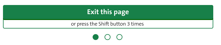
As well as the Exit this page button, users have 2 other options to activate the component.
The keyboard option, where the user can press shift 3 times, gives users a discreet way to activate the component, particularly keyboard-only users.
There’s also a hidden link in the tab order of the page. This appears before the ‘Skip to content’ link to ensure the correct tab order. This gives users of assistive technology an easier way to reliably activate the component.
The hidden link text is set as “Exit this page” and the URL is set to the homepage of BBC Weather. The URL can be changed if something else is more appropriate, but it will match the button.
Enhancement features
These features are included in the component and will work automatically if the user has enabled JavaScript in their browser.
Loading overlay
The loading overlay is a blank white screen that covers the content of the page if the component is taking a long time to activate because of slow internet connections for example. In such cases, it will cover the contents of the page whilst it’s loading.
Showing progress for shift key presses
Each time the user presses the Shift key, one of 3 circles below the button will fill up to indicate how many times it's been pressed.
The user has 5 seconds to press the Shift key 3 times. After that, the sequence and progress circles will reset.
Safety content page
We have a page on our website that gives users important information on how to stay safe online.
You must include this link when you use this component to help the user understand how the component works, its limitations and the other steps they can take to protect their privacy. Consider where this should be to make sure it’s obvious to your users.